
We love it when clients take the leap to remodel multiple areas of their homes! It gives our design team the chance to create a seamless, cohesive aesthetic that ties the entire space together. This week, we’re excited to spotlight a recently completed project in Kansas City’s historic Brookside neighborhood, a collaboration brought to life by the creative vision of Maggie Stephenson and the expert project management of Jason Goertzen.
Our clients fell in love with this home’s sensational backyard but weren’t as smitten with its interior. The kitchen and upstairs bathroom felt dark and dated, dominated by a brown-and-black color palette that clashed with the home’s 1920s charm. The downstairs powder room, on the other hand, lacked both space and personality. After working with us to transform nearly every inch of their previous home, the couple knew we could help them create a space that better reflected their style and the home’s historic roots.
This remodel was all about balance—honoring the home’s original character while reimagining the interiors to meet modern needs. From fresh, era-appropriate finishes to clever solutions that enhance functionality, the result is a home that’s stylish, timeless, and uniquely theirs.
Stay tuned as we take you through the transformations in these key spaces and share how thoughtful design brought this Brookside beauty back to life!
A Tale of Two Baths
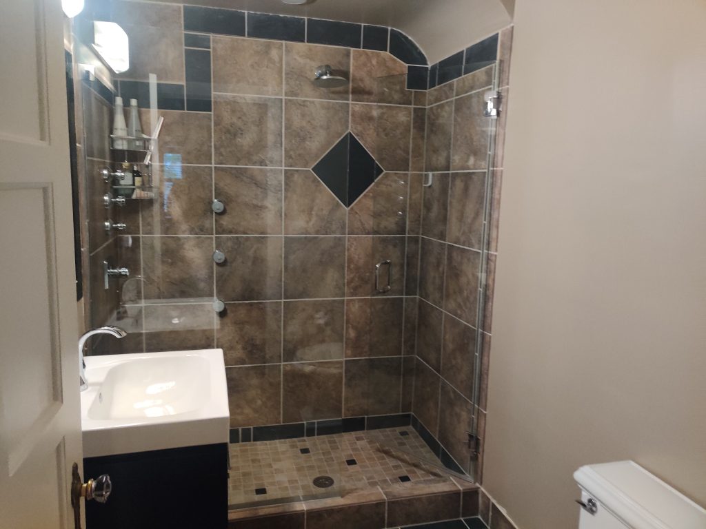
A Dreary Upstairs Bath
The bathroom’s existing shower was riddled with issues that made it far from functional. The drain was off-center and improperly sloped, leading to constant water pooling and inadequate drainage. The showerhead was awkwardly positioned on the wrong wall, spraying water directly toward the door, and the three body sprays were aimed at the glass, creating a chaotic and inconvenient showering experience.
The tile design added to the chaos. The large, uneven tiles felt out of place in the small space, and the odd design made the room feel disjointed. The tiles were even used as the room’s baseboards. The vanity was also too small, offering minimal storage, while the oversized mirror dominated the space, making the room feel even more imbalanced. Lighting in the bathroom also wasn’t ideal. The vanity fixture was a partial sphere and only provided a muted light, making the dark room feel impossibly dark. With no window and minimal access to natural light, this bathroom required a thoughtful approach to transforming it into the inviting retreat our clients had in mind.

Transforming the Upstairs Bath
The space is a blank canvas after removing all the fixtures and finishes in the hall bath.
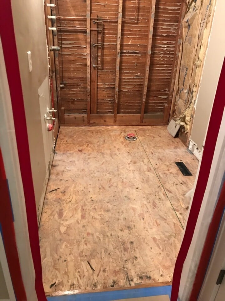
Occasionally, the subfloor requires work to make it acceptable for tile installation. Our team uses self-leveling concrete to create a new base for the updated floor tile.

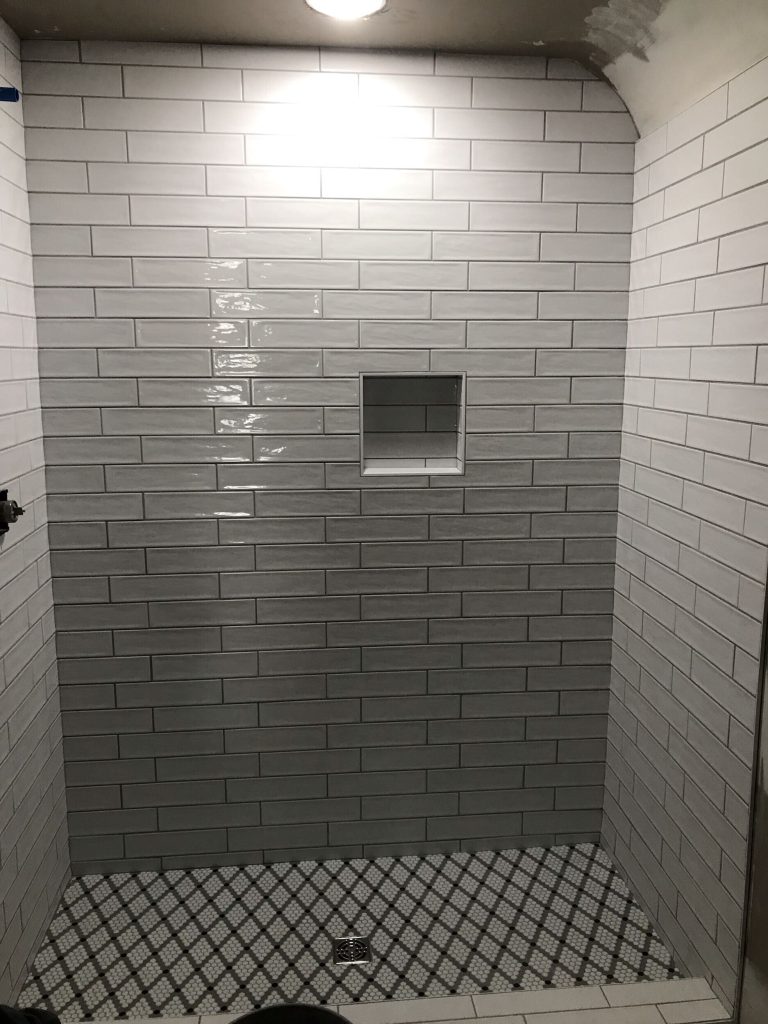
After we installed all-new tile on the shower walls and floor, this bath started to take on an entirely new vibe.
A Sparkling New Hall Bathroom
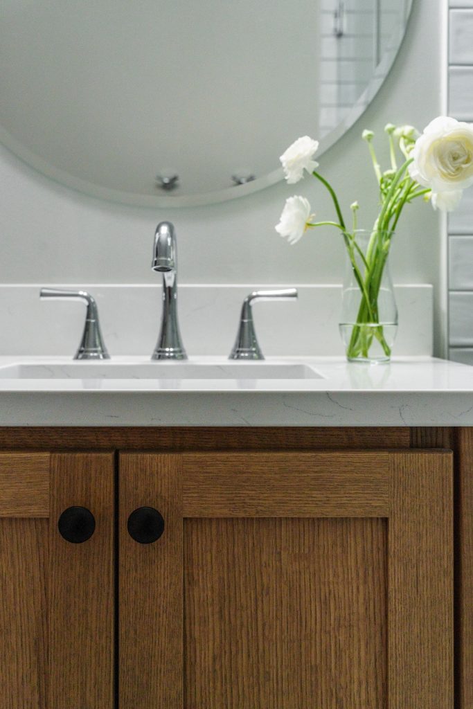
The redesigned bathroom now radiates brightness and showcases just the right amount of personality and style. The white floor-to-ceiling shower tile creates a clean and spacious look. Embracing a sense of playfulness, our clients opted for small mosaic floor tiles arranged in a chic diamond pattern. The new vanity has been thoughtfully updated to provide increased counter space and ample cabinet storage. A natural wood finish introduces an organic element and brings warmth and texture. We replaced the harsh vanity light with a softer, more contemporary fixture. The result is a beautifully balanced bathroom that perfectly marries style with practicality.

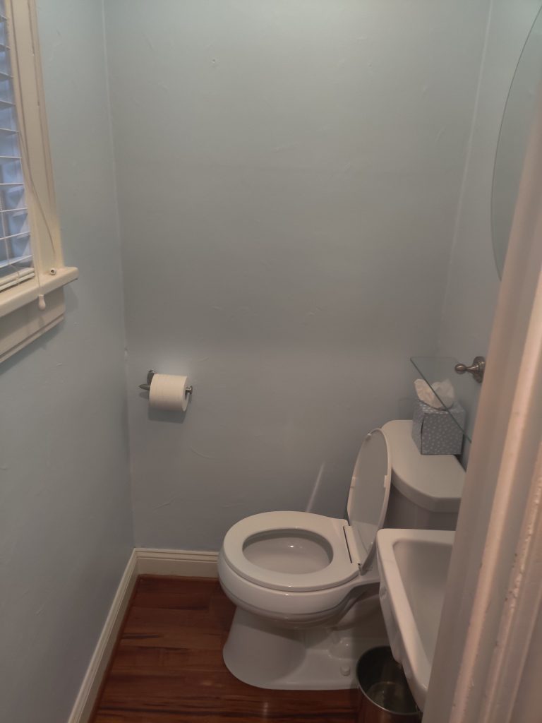
A Bland Powder Bath
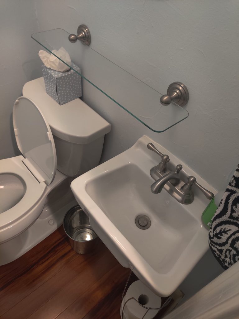
This tiny powder bath exuded an overly utilitarian vibe, offering just enough space to navigate but little else. The pedestal sink, while functional, served only for washing, contributing to a design that lacked any sense of style. Despite having its window, the room still felt dreary and dark, failing to take advantage of natural light. Our clients envisioned a powder bath that would not only serve its practical purpose but also showcase their personality and harmonize with the rest of the home.
Reimagining A Powder Bathroom
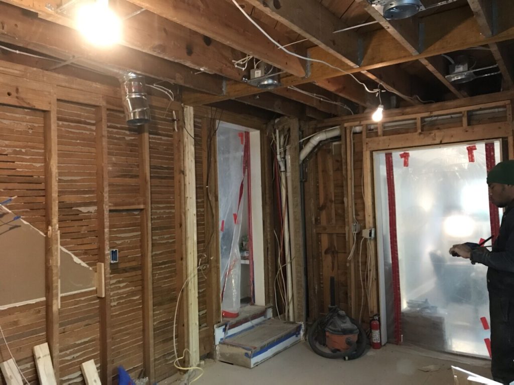
The original powder bathroom was tiny. While reimagining the layout of the entire kitchen space, we decided to optimize it and the adjacent kitchen pantry. We eliminated the small hallway to create a shared wall between the powder bath and the pantry. Now, both are larger and more functional. With the additional space, we could include a vanity and reposition the toilet and sink for an efficient layout.
Before

After
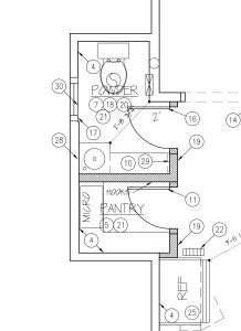
With all the finishes and drywall removed, it’s hard to believe this tiny bathroom wasn’t a pantry or storage space.

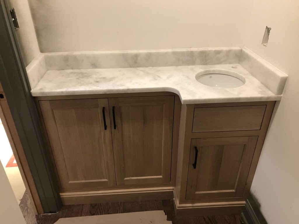
Deciding on the location of the new vanity took some thoughtful consideration. Eventually, we decided on this compact yet stylish vanity. This was a perfect solution for incorporating much-needed counter space and storage into such a small space. The combination of this unique vanity and the rest of the established design meant that this powder bath was destined to be singular.
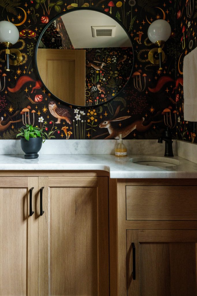
A New Whimsical Powder Bath
This new powder bath is a delightful blend of whimsy and personality. Powder baths are one of our favorite rooms to experiment with bold wallpapers, and we’re thrilled to see more clients embracing the unique character modern wallpaper can bring. Despite the space’s minimal square footage, we were able to rethink the layout to make it feel more open and functional while incorporating more storage. To add a vanity with adequate storage, we installed a compact L-shape cabinet and topped with a sleek white quartz countertop with a curved edge and a small corner sink. Across from the vanity, we installed a new toilet. We also incorporated a circular vanity mirror flanked with two globe sconces that add to the whimsical feel of the new space. All-new trim painted in a green color that compliments the bold wallpaper completes this playful retreat.
A Kitchen Dark and Dated
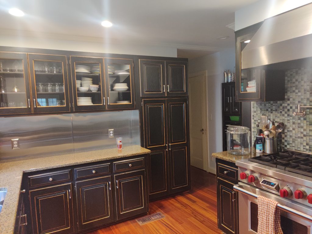
The kitchen in this home had many interesting qualities that our clients were eager to change. The black cabinetry made the kitchen feel dark. The weathered finish only added to the kitchen’s dated appearance. The tan granite countertops, similarly, had lost their charm. Above the sink and primary workspace was a sheet metal backsplash that introduced an industrial look that clashed with the rest of the room. Above the stove was a square mosaic tile that also failed to harmonize with the rest of the space. The layout also posed additional challenges. The fridge was too big for the currently occupied space, and next to the kitchen was wasted square footage that lacked purpose. Our clients imagined a brighter kitchen with a more cohesive design that utilized all the space available to make it more functional.


Creating the New Kitchen
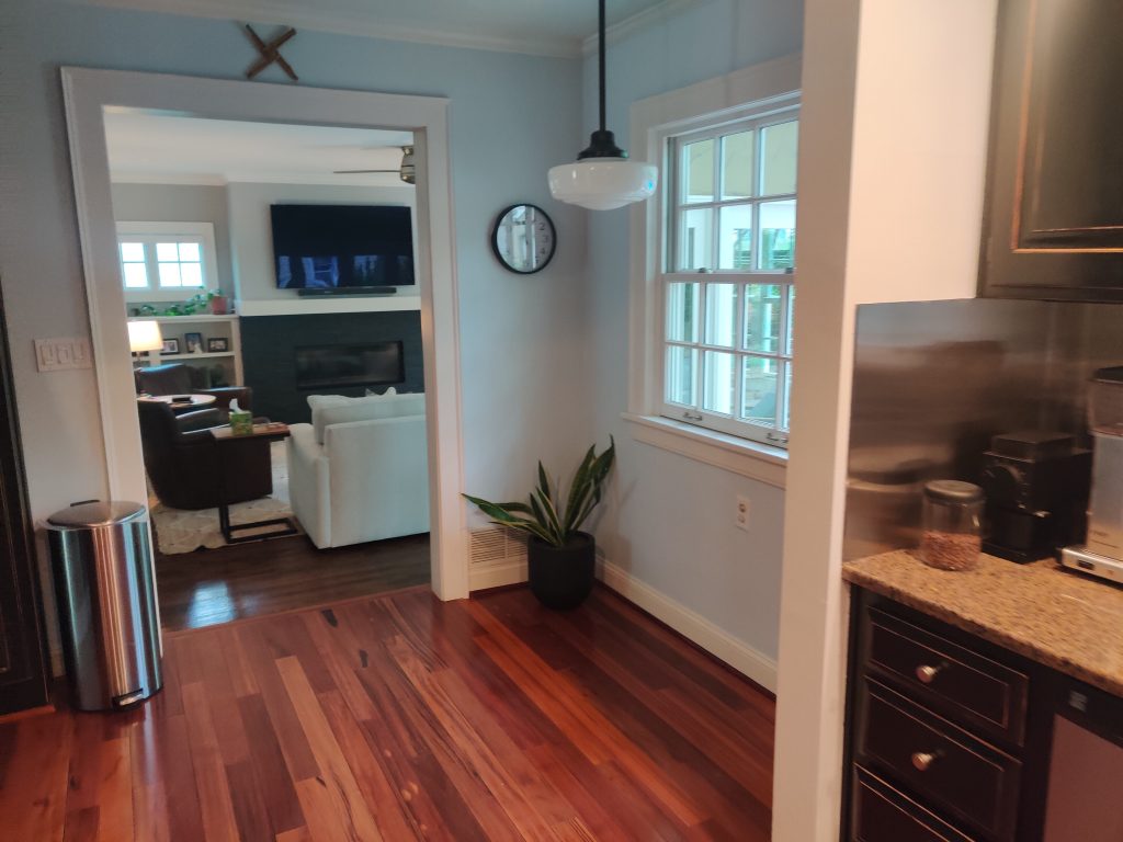
The original kitchen layout presented several challenges that made it both cramped and inefficient. The available workspace was poorly positioned, far from the main appliances. Additionally, the kitchen lacked sufficient storage, leaving our clients struggling to organize everything. Other significant issues included the pantry’s inconvenient access, the fridge’s awkward placement away from the main kitchen area, and a section of wasted square footage between the kitchen and living area. This space was initially intended to function as a breakfast nook, but its placement obstructed traffic flow, rendering it largely unused.

The new layout is a game-changer in terms of practicality. By reconfiguring the pantry and adjacent powder bath, we expanded both spaces and created more convenient access from the kitchen. The additional space in the pantry allowed for a microwave to be installed. To maximize the size of the kitchen, we removed two partial walls, extending the cabinetry and counter space all the way to the living area’s entrance. Relocating the fridge to a more centralized and accessible position improved the kitchen’s overall flow. We also made thoughtful adjustments to the work zones by slightly shifting the dishwasher, sink, and window above to create additional workspace on either side. Similarly, we reworked the stove area, extending the counter space and offering more room for meal preparation. The result is a bright, open, and highly efficient kitchen.

The new framing for the repositioned sink window demonstrates how even minor adjustments to a layout can make a significant difference in the functionality and feel of a space. By moving the window slightly and opting for a larger size, we not only improved the kitchen’s access to natural light but also enhanced the overall balance of the design. With the expanded layout, maintaining a cohesive and harmonious look was crucial. The adjusted window placement ensures that the kitchen’s proportions remain visually pleasing while complementing the increased counter space and cabinetry.

The redesigned pantry features an L-shaped shelving layout, making it a walk-in style and feel more luxurious. Inside the pantry we also installed two outlets. One is dedicated to the microwave-a must-have appliance that our clients prefer to keep out of, while the other accommodates additional appliances, offering flexibility.

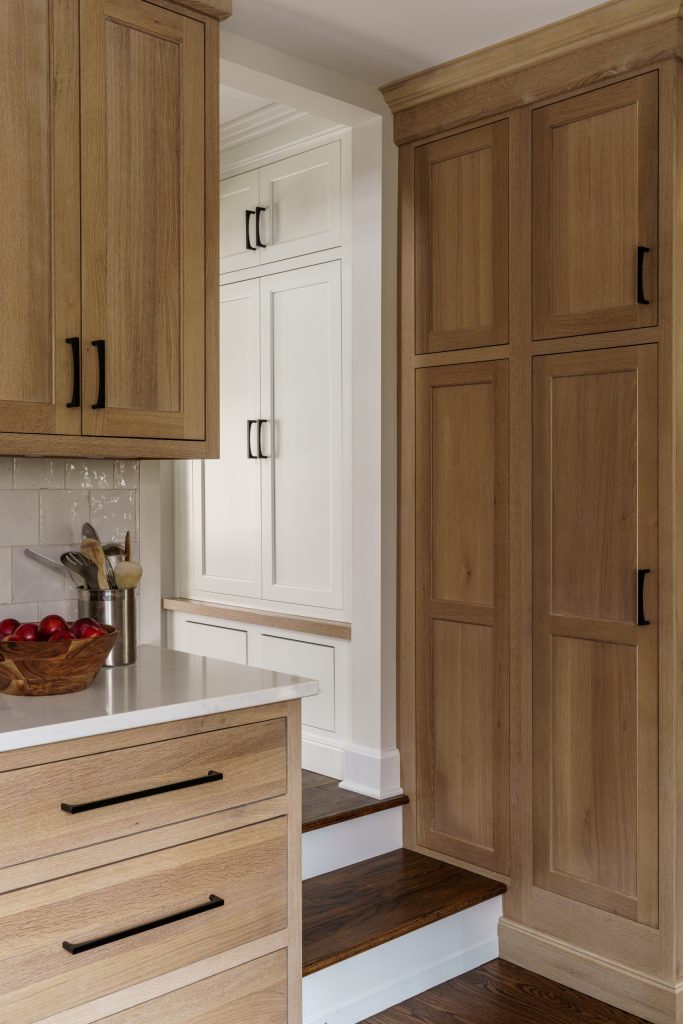
One of our favorite features of this kitchen remodel is the wall that houses the new entrances to the powder bath and pantry. It is clad entirely in the same elegant white oak as the cabinetry. The subtle camouflage effect of the white oak blends the entrances and enhances the overall warmth and truly wraps the new space with an inviting and natural feeling.

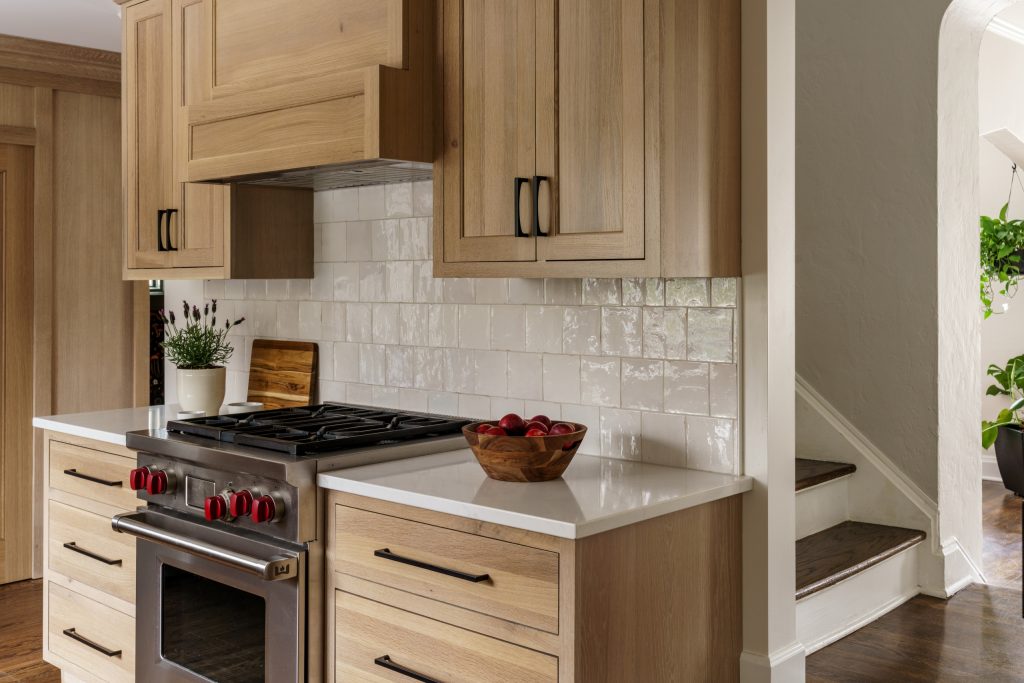
A New Functional and Dreamy Kansas City Kitchen
The transformed kitchen is now a bright, open, and inviting space, defined by its cohesive design and sophisticated white and natural white oak color scheme. We maximized functionality by incorporating ample storage into the new layout, making the most of the expanded space with additional counter space and cabinetry.
The upper cabinets are now taller and offer extra storage while creating the illusion of greater height in the room. We designed symmetrical lower drawers and upper cabinets on either side of the stove for a balanced and polished look. The range hood, clad in the same beautiful white oak as the cabinetry, seamlessly integrates into the overall design.
Under the upper cabinets, we added discreet outlets for small appliances and strip lighting to illuminate tasks. To keep the space fresh and modern, we installed durable white quartz countertops and a counter-to-ceiling textured white square tile backsplash—a welcome upgrade from the previous metal sheeting.
The sink now features a sleek chrome faucet that complements the new, larger refrigerator and the existing Wolf stove. Modern matte black pulls add a touch of contrast and a contemporary look to the cabinetry. Our team turned a dark and dreary kitchen into a functional and stunning home centerpiece.

The new window floods the kitchen with natural light, transforming the once dark and cramped space into a bright, airy, and welcoming environment. This redesigned section of the kitchen, previously underutilized and wasted, is now fully optimized for both function and style.
We concealed a new dishwasher within the cabinetry to maintain the space’s clean and seamless look. For a touch of personality, we incorporated a single open upper cabinet, perfect for displaying decor or meaningful items that add character to the kitchen.

Before, at the bottom of the stairs, there was an open cubby for jackets and shoes that often left the space cluttered. Next to it was a single narrow black cabinet that offered minimal storage. For this space, we provided a more sleek and functional storage solution.
For more discreet and organized coat and accessory storage, we installed a fully enclosed system tailored to the family’s needs. This includes two lower drawers for shoes, a tall coat cabinet, and a smaller upper cabinet for essentials like hats, gloves, or bags. We replaced the outdated black cabinet with a new design featuring double the storage capacity, crafted from the same elegant white oak as the kitchen cabinetry.
The homeowners couldn’t be more thrilled with the transformation of their kitchen and baths, which have been reimagined to blend style and functionality perfectly. The new light-filled kitchen now boasts incredible storage and a cohesive design. Coupled with the whimsical powder bath and the refreshed upstairs hall bath, every space has been tailored to meet our client’s needs and reflect their vision. The homeowners are excited to entertain, cook, and enjoy their updated spaces for years to come. We’re just as happy to have been part of such a meaningful transformation!
Ready to make your home dreams come to life? Contact us to speak with a remodeling expert.